16 Dec 2015

Manchester Town Hall Illustration


This illustration was one of my most challenging images to create. The angle and shape of manchester town hall is very awkward and the building involves lots of symmetry. I was trying to keep it simple and go off my instinct when it came to creating pen marks. I think the tents up the side of the building work really well in this piece as they almost envelop the building. 

Ive followed my original design and tried to show my ideas clearly. The idea of homelessness on the door steps of the town hall, but almost hidden away. Its there in the background, but its always ignored and people struggle to acknowledge it. The only point I'm concerned about is that the image appears blurry for some reason when on a computer, Im not entirely sure why that is. 


10 Dec 2015

My Own Newspaper !!! A Point Of View


I can't believe its arrived and it actually looks like a newspaper !!! a professional one as well. I couldn't be more happy with how its turned out. I did have to improvise with a few pages because I felt like having standard square images made it a bit boring, so for example the magpie page I tried to change the composition and grab a part of one of my other images. Using my research into how newspapers should look and how the pages work together throughout. 

I think the best part of it it is the way the work has been printed, it has an almost faded look, but I feel like its added to some of the drawings especially where there is areas of solid colour, like the blue on my scissors one. Im sorry these aren't the best quality images to show you my newspaper, but I will be uploading some soon. I think things like this will help to push my work further and improve the standard of it. 


9 Dec 2015

The Sea


The aim of this piece was to really highlight that sense of isolation and being far away from anyone else. I made the man on the raft further away and smaller, as if you were looking down upon him. The sea is a very lonely place for a person on there own, inspiration from artist Edward Hopper. I think the landscapes and natural elements within my drawings, work well and help to connect the images together.

Hands - Hands are a huge part of my thinking process and capture the ideals of my work. Hands can represent so many different things, in this case it was the idea of reaching out for help. The black to me is a sign of negativity that often unfairly associated with homeless people, so I tried to counter balance that with making the person as white as possible, to reflect his innocence.

If I do have a negative with this piece is that I could have done more to highlight the person on the raft as he can become lost in the detail of the sea, but on the other hand that could help the idea of this piece of him being a lost individual. Its quite hard to explain this one , but I truly believe in this piece.

2 Dec 2015

Inspirations Rembrandt


I did a post earlier in the year when I went to Amsterdam over the summer and was lucky enough to see Rembrandt's work up close. I love the style of his work, especially the etchings he created. They look so modern to me and the dark and lights contrasts work so well. 

In my own drawings I've tried to use the same free flowing gestural movements as he did, which is very challenging to not make look like Ive just rushed my drawings. I think I've developed my own style now, but you can see the influence of rembrandt upon it. I've not just copied his style, but used it to influence my own.


1 Dec 2015

Feeling Lost


This piece is all about capturing the essence of government cuts, which are having a huge effect on the homeless, especially in Manchester.
My inspiration for this was Salvador Dali's surrealist drawings, where there is always a mood created in the piece. I think this piece is a success because its a more simple design and clearly links to the topic of homelessness, but not in an obvious way.
I wanted space and perspective to come into play, so I made the scissors seem huge in a desert like world and the people a lot smaller. This was to make the cuts almost dwarf over everything in the land. The colour scheme was my own idea as I thought the dark and colours best represented my own feelings towards the whole situation.

There is definitely a surreal feel to this and artists that I've researched like Dali and Henry Derger contributed to towards my final outcome.


30 Nov 2015

Scissors Front cover / Geoff Grandfield inspiration


I needed something to put on the front cover of my work and I didn't want to just use the same images I've already created, but something new, simple and professional. One of my inspirations from last years projects was artist/designer Geoff Grandfield. I really admire his use of silhouetted shapes to create forms and his minimilistic use of two or three colours. I wanted an image that captured the mood of 'point of view' podcasts, but also best showcased my work. 

So what I did was analyzed what worked as solid shapes in my work and found the scissors as the most appropriate shapes to use. I limited my colour palette and experimented with shapes and sizes, until I created the above image, which I think is a success. The reason for that is even though it looks different the feel and end product look similar to my other images, with the use of mark making again to bring the piece together. 

you can check his work out here - http://geoffgrandfield.co.uk


18 Nov 2015

Snow Leopard

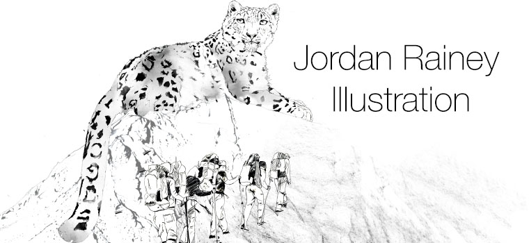
I really enjoyed creating this piece, as I always enjoy drawing animals. The idea of this one was to show a metaphor for trying to pursue Happiness and I related that being homeless ( confusing aha).  The snow leopard is a symbol of survival and isolation as leopards are often completely cut off from everything else. They have to try and survive so it was the ideal animal to relate to my subject.

With this piece there is a surreal feel to it, with the leopard meant to be almost part of the mountain - looming over the climbers, who are homeless people. In my initial sketches I wanted the leopard with its camouflaged fur to almost be invisible, just as homeless people often feel they are.

The mountain was so hard to create it almost gave me a headache, I focused on getting the shape and form right.


I wanted climbers to represent the struggle of being homeless and the effort each and every day takes just to survive.
Using mark making and a solid drawing I managed to create this.The eyes were the most important component in this as they capture the mood of the animal. 


17 Nov 2015

Visual Metaphors


Visual langauge and being able to communicate an idea is integral if I want to make it as a professional illustrator. One way of achieving that is using metaphors to communicate a piece of text or an idea - whatever the illustration is for. its a really smart and precise way of interpreting something. 
I have over the last year started to bring this into my own work, but I sometimes dont make it really obvious what its about. So with this project the snow leopard idea that I have isn't immediately obvious, but you can piece together all the different aspects to create a visual metaphor. Its a way of working that I like to use as it differentiates my work and isn't the obvious. 


Often humorous, sometimes risqué but always witty and intelligent, Paul Blow comes up with exceptional ideas. His work is what good illustration should always strive to be— clear, precise communication.


Combines thoughtful symbolism worked into his compositions with considered drawings and painterly textures. He creates very interesting narratives within his image. 

15 Nov 2015

My Newspaper ( Down and Out )


David Parshott's http://www.davidsparshott.com/portfolio/creative-review/

To get my work onto the next level and to push myself further I decided to create my own newspaper using the great website 'newspaper club'. Its a website where you can create your own layout and design and use your images..... I thought this would tie in nicely with my project as the images i'm creating are quite political and news orientated. However the problem I had at first was that Id never designed my own newspaper and there was a lot that needed to be considered, from composition, page layout and images relating top the text.


Research 

The only way I would be able to understand what it is that makes articles and images work was by looking at some. Creative Review is a magazine targeting the art scene, reviewing modern and contemporary art. The first aspect I noticed was the professional look the paper had and the seamless link between images and text. 

The images used were often clever and often metaphors for the text. Each image had its own meaning, but they always linked to the text and 
challenged me to try and find out what the link was. For example a magazine I saw had a picture of a magpie and the article was about stealing, which magpies are synonymous with. I want my newspaper to have the same professional feel and design. 

The core design and layout was the most important part for me, as it had to resemble that of a newspaper. This article on data presentation was a help. From my research I found most newspapers stick to the same formats, so font size, columns and image size. This is to keep a consistent layout and this makes artists design images to work with a format. So my aim was to follow the blueprint of arty magazines such as creative review and let the page work as one. 


4 Nov 2015

Shadow Art by Kumi Yamashita


Born in Japan but now living and working in New York City, artist Kumi Yamashita does incredible things with light and shadows. Kumi has an impressive list of solo and group shows sine the late 90s along with a host of permanent collections around the world. 
In her series entitled Light & Shadow, Kumi uses a single light source along with an assortment of perfectly placed objects to create incredible shadow silhouettes and artwork on walls. One aspect I wanted in my own work was the idea of shadow and creating a mood. Shadows are a great way of creating a mood and the light and dark shades work very well, so this artist helped me to get a sense of what I wanted my own work to look like. 

3 Nov 2015

Magpies


One of my original ideas was the use of magpies as they repseresnt stealing and homeless people are often unfairly associated with that. I wanted to keep the image simple and use negative space to keep it from looking too cluttered on the page.

Ive used mark making with the magpies as I wanted them to look playful and mimic what real life magpies are like, the colours work well as the vibrant blues and green contrast nicely with the dark black of the birds feathers.

The image on the left is the one I've used for my newspaper. I used different ink and block printing ink  to create the marks below the magpie. They are experimental, but help to form an interesting composition.

I dont like the straight edge of the second image, but unfortunalty time constraints limited me to coming up with some way to not make it look like the man was floating in mid air :)

14 Oct 2015

Ideas/ not losing sight


One of the main things I have to keep in check is the core ideas behind my drawings, they have to represent and reflect what it is I'm focusing on. One of the main issues for me was being able to come up with good enough ideas quick enough in a short space of time. In my own opinion I over think things, I spent all summer researching and coming up with ideas' that I lost sight of what it was I wanted my project to be and what I was trying to communicate. I felt like I had a mental block with what I was trying to say with a pencil. The ideas just weren't coming out naturally and felt forced, as I was thinking too literally and not challenging myself with my concepts and ideas, like I have done in the past.

In the end I came up with lots and lots of different ideas, even it was just tweaking my original ideas. However I came up with varying ideas, not just the same one. Most importantly my ideas linked to the concept of homelessness and communicated an idea of throughout the use of metaphors.

Idea 1 Snow Leopard ) 


PLEASE WATCH THIS ITS AMAZING !!!


The Idea revolves around a snow leopard. They are one of my favorite creatures, but are often never seen as they live in remote and isolated areas. They fend for themselves and I saw a link between that sense of isolation and being homeless. So I wanted the leopard to work in some way with the homeless man. I was playing around with the idea of someone climbing, possibly its tail struggling to reach the top and there final destination.

Idea 2  The Sea)

I was really excited about this idea because I knew from my own instincts that it worked and captured the isolation well. I wanted to use the sea as its so unforgiving and lonely by yourself. I like Edward Hoppers paintings I looked at earlier in the year, with the idea of being far away and in the distance -  almost not there. So perspective was crucial for this piece to work. The hands symbolize reaching for help.

Idea 3 Scissors) 

Government cuts are a big part of why so many people are becoming homeless, so for this one I tried to think straight forward about a simple design that someone would know instantly what the piece is about. So I thought of government cuts and got scissors from that and they linked. Just like with the others I wanted it to feel like you were lost almost.

Idea 4 Manchester town hall ) 

The town hall the epicenter of all things manchester is where most things like government cuts happen so I wanted to include it somewhere within my image. I wanted tents to come up and almost dictate the shape of the main town building and start creeping in.

Idea 5 Magpies ) 

I struggled with this one, but I had a core concept of magpies as they are associated with stealing, as are homeless people unfairly.


6 Oct 2015

Abram Games - Communicating an Idea

Abram Games was good at composition and getting the message of the image across. This was about growing your own food and its really cleverly done in how he uses the spade as ship. I need to try and emulate this in my own drawings and get my message across.

28 Sept 2015

Charles Glaubitz


This isn't the usual style of artist that I would look at, but I found his work so beautiful and I got a real sense of the mood and meaning all his work. I just think its really clever the way he produces work and the ideas he comes up with. The attention to detail with whats in the forefront/ background is the best part of his work, as it allows his work to breathe and for images to really stand out.

From my own artist interviews I went through last year, one aspect I learnt that was crucial was the stage before the finished design - the idea stage. Im struggling myself to come up with good enough ideas atm, because I'm thinking to literally and obviously. What this artist does so well is not draw the obvious but something different and unique, not just drawing out a homeless man if the articles about homelessness. I need to learn from his work and ideas and try and implement them especially in the ideas stage.
Even the initial drawings he has created really reflect and show what his intentions are for the end goal, which is great fro showing potential clients early ideas.


22 Sept 2015

The Wellspring (charity visit)


To donate to the wellspring visit here http://www.thewellspring.btck.co.uk


Im not homeless and Ill never understand or know what its like to have my life affected in such a way. Therefore I need to try and get the best possible understanding of it and understand who it is I'm trying to communicate to. This is why I visited the Wellspring charity in stockport, whose primary goal is to help and aid the homeless.

This would give me a better insight from people who are actually homeless and people who work day in and out with the homeless. I arranged to meet with project manager Jonathan Billings who was more than accommodating of me and offered his thoughts and ideas to my project.

I was apprehensive about going there. I don't know why, but i felt awkward ( ridiculous pre ideas) To just see the people and hear what they've been through really gave me a different perspective and changed my feelings towards the homeless.


I asked a few questions to Jonathan and the conversation just expanded from there…….
Im not writing down everything he exactly said, just best as I can because I was listening to what he had to say.

Are Government cuts having an effect on the number of people becoming homeless ?

This was the most definitive answer he gave me… It was a emphatic yes, the numbers have gone up a large amount especially in the stockport area with council cuts having a big effect. The numbers have gone up three fold in just a few short years. People aren't getting the support they need and cuts to things like benefits, social housing and loss of jobs are having a dramatic effect.

He did say in terms of housing the wellspring are helping to accommodate people in low cost housing, with the council being quite helpful in that regard. One of the problems of this though is that in order to be able to get say housing or benefits, you have to be able to fill in online forms and make sure they are filled in on time and correctly. The problem being most homeless people don't have access to computers on the internet so this does become a problem. The wellspring are trying to help with this with computers being used within their complex. Donations from food, clothing and money are up from lots of different people and organisations as more people in the public are seeing whats happening.


They have an active relationship with stockport college and these illustration posters helped to raise awareness a few years back. 


What are the main reasons behind people becoming homeless ? 

Obviously there are a number of reasons, but I wanted to know. He mentioned a lot of different things from persistent drug use, troubled upbringings, violence with families and psychiatric reasons. I did ask him is it a stereotype to say all people who are homeless on drugs ?, he did say it was, but a large proportion of people at the wellspring are there because of persistent drug use and a reliance on drugs. Often stealing to be able to get the money. Even though I know that happens it is still a shock to hear.

Another story he told me that happened recently was a man who suffered from schizophrenia refusing to take his tablets and becoming worse, to the point where he was sectioned quite violently. Not all homeless people are drug abusers, but often struggle with psychiatric problems.

Jonathan Billings 

Not everyone who attends The Wellspring would be homeless, but 95% of the client group are people who would be at risk of becoming homeless. The Wellspring feels very strongly that engaging with the people who are at risk of homelessness is the only way to reduce homelessness in the future. Prevention is so much better than cure.

Do people choose to be homeless 

This was quite a controversial question, but to my surprise he did say this does happen. For example there is someone in stockport who isn't homeless and pretends to be, the hook he gets people on is that he has a dog and he sits near the pet store - he makes a £100 a day apparently. This was a shock as I walk past him a lot and often sympathise with him and can see how the dog works. 

The wellspring had many ways they provided support, for example art classes every friday to try and get the creative side out of some very creative homeless people or the homeless band they are currently in the process of creating. All things that help them. 

This was a great experience for me and helped me look in a different way and hear from someone with first hand experience. I got to see first hand the great things the Wellspring are doing with there brand new building and clear structure. All helping the homeless people of stockport. 
To donate to the wellspring you can donate here http://www.thewellspring.btck.co.uk

21 Sept 2015

My view (Manchester)


To try and think in a different way and come up with new ideas, I thought it would be good to take some photographs in manchester to try and capture the life of someone endlessly walking around. I have to admit I felt uncomfortable at times sat down whilst the masses walked past. It felt as if everyone was staring at me and as if I shouldn't be there. I wasn't pretending to be a homeless person of course not, but I was trying to capture the same lonely essence and feeling within my photographs - hence the use of black and white images. 

One aspect I did notice is how empty some certain areas of Manchester are, almost forgotten about and left to wither away. This was a different way of working for me, but I felt like it may make me think in a different way and it's helped me to come up with different ideas. 

I saw some interesting characters and I found personally that a lot of people were just walking around aimlessly almost with no purpose. You really see things in a different perspective when observing whats around you.