28 Apr 2016

NHS waiting Times


Rather then showing all my initial ideas separately, I thought it would be a better idea to show you  both the initial and finished illustration. Then you can see the process I go through and how my idea develops. 

This initial idea is based on the news articles about NHS waiting times and the effect government cut's are having. I tried to think of symbols or visual metaphors related to time and waiting. So I wanted some kind of clock or alarm clock that I could manipulate into a building, that people would then be queuing up to. I wanted to keep the image simple and reflect the nature of the story. I started out with a few rough sketches and played around with the composition and type of clock I wanted. 


I realize its not the best picture. 


This is the final image. You can see the process I've taken from my initial sketches. I am so happy with the final outcome. I think I've refined my style of work to include the detail in the figure, but use simple almost graphic imagery to complement that. I decided to add a chimney and a door to make it look more like a building rather than a clock and went with quite neutral colours that I thought work well. 


26 Apr 2016

Abstract Front Cover


I wanted something for a front cover, but like the previous project I didn't want to use the an image I had already done, so I decided to try and create something abstract and different from the other images I had created. I enjoyed making this as I could really be creative with composition and use of colour. I think this has been a success.

25 Apr 2016

A Soliders Story - flashlight


This story is quite a hard hitting serious one, so I wanted to reflect that In the imagery. I didn't want it to be too detailed and just show the core idea I was trying to get across. My initial idea was centered on the idea of the flashes of light. Solider's often after war struggle with light as it often reminds soldiers of a war zone and the bright flashes of light that they have to deal with. I thought of using a flash light as a metaphor for that and focusing the composition on the soldier on the floor. The hand again is such a powerful image to use so I wanted to use that. I was thinking about composition especially with this one. 


This is the final Image. I tried to incorporate a pastel texture into the image and a shadow on the person so it didn't look as if he was floating. Im happy with the colour scheme, however I may change that in the future. 

21 Apr 2016

Contacting Art Directors/Artists


As part of my university course one of the tasks set out to us, is to contact art professionals. So art directors of editorial newspapers would be an example. After creating a client list with my preferred choices, I sent out a number of emails, briefly stating who I was and why I thought my work could be a good fit for their company. I attached a pdf containing a few of my images and a link to my website. I found this process incredibly frustrating, as I found that a lot of the art directors I was emailing weren't responding to me and often not opening their emails. Its disheartening and annoying, but I wasn't prepared to give up. 

So I emailed more art directors and sent samples of my work, deciding in the process that rather than narrowing where my work could fit in, I looked at publishers as well as editorial companies. I think my style of work is aimed more at adult style books, so I only contacted that kind of client. 

Luckily Ive had a reply !!. From an independent press publisher called 'Atlantic Press'. Its a publisher primarily run by illustrators. The main theme of their books is 'Authorial Illustration'. So its all about creating graphic literature, with the illustrations created around the artists words. Its all about letting the illustrator be the driving force behind whats in the book and the type of work they want. 
I hadn't really thought about this type of illustration before in terms of my own work, but the type of freedom and style of illustrations really interested me and this is definitely something I want to look into. 


The work is different from what I do, but I can see my work fitting into this kind of genre. These beautiful illustrations are by Elizabeth Blue and Charmian Hussey. 


I emailed the company and luckily someone who helps run Atlantic Press called Stephen Braund, replied back to me. He was really nice down to earth guy who also very kindly sent me a free copy of the book above with a nice note wishing me good luck for the future. In a phone conversation with him, I asked him what he thought of my work as I wanted his invaluable advice about my work. He said 'you have great potential and I can see the direction your work is going in' He compared my work and way of working to 1984 book illustrator Alex Williamson. 
He then recommend this authorial type of illustration and that my work could be a good fit for that style. It is nerve-wracking talking to someone like that, but it really helped and encouraged me to know the positives people see in my work. 


I didn't really know who Alex Williamson is, but I can see why he compared my work to his. especially his use of hands, which I often use within my work. I love the book 1984 swell. 


20 Apr 2016

My own book !!


As part of my dissertation I had to design and illustrate my own book. My dissertation was based on 'visual dynamics', so aspects of picture making like line, shape and texture. I experimented with space and composition and I wanted a professional clean look, with hints of mark making and texture throughout to reflect my essay.

I am so happy and proud of what I have produced !!.

Artist Advice - Rohan Eason

I contacted illustrator Rohan Eason to see if he could give me any advice on my portfolio and wesbsite. Ive done an interview with him on the Q & A Blog section on here. Thank you Rohan :) 

Rohan 

Hi Jordan, 
Your website is looking great, a lot of strong images, with Nice use of block colour and line. 
You've said your style is editorial, 
I would be careful about using this word to describe your work, and also for you when creating your work. 
Editorial is the lowest paid area of illustration, and while it is a good staple if you can get a consistent monthly or weekly magazine, it will limit the scope of your work. 
Being a commercial illustrator is about having a distinct style which a client can see working with their project, no matter what area that project lies, so I would suggest beginning to explore other areas of interest for inspiration. 
You have a nice pen style, and I'm sure you could work in other types of publication and media outlets. 
I would also suggest adding some work with faces, specially for editorial, but in all areas of illustration, the base skills of rendering the expressions of a human face are really important. It's a good tool for connecting with your client, if the figures are always turned away, or hidden, that's how your work may seem. I think that's the main criticism I would have, I want to put a face to your work, 
Hope that helps, 
Best
Rohan

Me 

Some great advice from Rohan in my opinion. Its good to know a professional likes your work. There is some really good constructive criticism here as well. In particular about not putting all your eggs into one basket, in my regard, not just doing editorial, but all forms of illustration - book, advertising .... I need to work on doing a few illustrations in books and other areas and not label my work as editorial. I completely agree with him in terms of drawing faces, its not something Ive intentionally done, but I can now see my work does lack facial expression, so I will work at that side of work and incorporate faces. 

19 Apr 2016

About Me - family history

I know my blog is more about my illustrations and my artwork, but I wanted to add a bit of personal information about myself. My family have been researching into my family history and we have found some really interesting things. 

Firstly I already knew this, but my name and my family have so many connections with Ireland, particularly southern Ireland. I have other connections with Wales as well where my granddad is from. 

My second name Rainey is an irish name and in Gaelic it is Ó Raighne. 

I have lots of connections in my family with world war two, with lots of my family acting as soldiers at that time, which I'm proud to say. The most interesting learning point was my dads side of the family. We discovered my that my Grandma's parents were both from Russia to our surprise and they were both jewish. They fled from Russia in world war one. It was so fascinating to learn about. Im proud of my now English, Irish and Russian ancestry. 

18 Apr 2016

Occupy (Book)


I realize my work and what Ive centered my illustrations on isn't necessarily this book is about, however this book is about protest and politics, so I thought it could influence the way I thought and potentially allow a political undertone to my work. So I went about reading it.


Occupy - Noam Chomsky 
Occupy is a political movement that focuses on social and economic inequality. With the aim of getting wealth more spread out and distributed to ordinary people.


This book is not written by Noam Chomsky per se, but is rather a compilation of transcripts from interviews he has done and speeches he has given relating to the Occupy Movement. There is a lot of insight and information in this book about the occupy movement. Sympathizing with their cause. This was a really interesting book and it gave me lots of ideas about symbolism and political forms of artwork. There is a theme of the against us and if I had to illustrate a book like this it would be about getting that imagery to reflect that. 


15 Apr 2016

Creative writing and sport


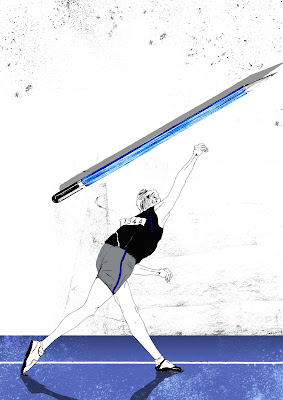
This was a really fun and exciting story about creative writing and sport in schools and trying to combine the two together. I had lots of ideas about this one, as visually I could see how I could combine the two sports and writing together. 

I initially had the idea of someone throwing a javelin in the form of a pencil. I wanted the pencil to stand out as if it were almost coming off the page, so I thought about drawing it as realistic as possible to make it stand out more.


This is the finished outcome. I really like the pencil and the 3d effect of it I have managed to create, however Im not personally convinced with certain aspects of the drawing such as at the white space background. I think it may need working on and a more coherent colour scheme adding to it. 

14 Apr 2016

A soldiers story


I wanted to create a piece of work that captured the isolation and almost dreamlike situation soldiers find themselves in. The idea of running away from your past and the doors to your past always surrounding you. The biggest positive of this image is the colour scheme in my opinion. I have been a bit more adventurous in the colours - I have been using lately and wanted to create a desert like feel, so I think the golden yellow colour works well. The forms on the page such as the guns take on a form of their own and almost look tree like.

13 Apr 2016

Hopes and Fears

I think one thing I've realized over the past three years, is how much my work has changed and how different I now approach work. I used to be so focused on getting my drawings to look exactly like what I was drawing from. I started out as more of a fine artist and never really considered myself as an illustrator. Now my work has been compared to graphic design work. I'll always have drawing as my core principle though.

One of the main concepts I have found is the conceptual and editorial route, where my drawings are more inspired by politics and current affairs. I have a keen interest in stories like that and think my style of work is more catered to that type of adult drawing.

One part of being an illustration student, I haven't enjoyed is being able to just enjoy drawing or take time on a picture. The pressure of university is hard and sometimes I feel like I'm doing everything other than drawing or creating art, just to try and get a grade. For example I love to paint in water colour's and oils, I haven't been able to do that at all in the past year because it takes to much time to do and I don't have that time. I will be doing more painting in my spare time when I leave. I love being an illustration student, I just feel sometimes I don't know my own style yet and I think my drawing skills come first.

My main fear with the future, is something that I'm starting to realize now especially as I'm trying to contact art directors. Im worried about getting an actual chance to be a professional illustrator. I need that break and that chance to be able to create work for a newspaper or a book, but there are so many people applying for work. Ive found art directors rarely ever contact you back, especially if your not a well known artist. So the idea of the unknown is a worry, as I want to be able to have a steady income.
Art is very unpredictable money wise, so my aim is to get a part time job, hopefully related to art so that I can continue doing something I want to do. Another fear I have is losing contact with people from my university class, its great to know someone in a similar situation to your own, that can be there to provide help and advice with work, so hopefully I can keep in contact with some of them.

Im proud of my work and I have put my all into this course. I didn't put enough effort into one of my briefs in the first year and ever since then Ive been so determined to do the best I can and for people to be impressed by my work. My dream is to become a professional illustrator and I am fully determined for that to come true. My hope is to get a fair chance at being an editorial illustrator.

NHS Waiting Times - Watchmaker


For the NHS waiting times story, I again wanted to try and create something around the theme of time and tried to create symbols/imagery based on that. My initial ideas were based on a watchmaker and the doctor trying to fix it. Ive tried to think of interesting compositions with the viewpoint almost looking down on the doctor from above. 


This is the finished drawing. This was the most frustrating drawing I have had to do so far. It was so difficult to get the right shape on the face and make it look like a person, rather than a bunch of random objects. 


12 Apr 2016

John Holocroft illustrator/research


Above are two illustrations by artist John Holcroft. I really like the clever use of visual methaphor and the use of almost simple things such as a hand holding a cigarette begin turned into a clever and clear message. It maybe digital slightly, but I think the way he has thought about the images and come up with the ideas is very interesting.

1 Apr 2016

Political/editorial Artwork


Charlie Hebdo Artwork

I think political artwork with a message behind it, is so powerful and can reflect the story and idea of any story. The illustrations created after the Charlie Hebdo attacks were particularly powerful and reflected the idea of the power of the pencil.

The metaphorical language used is really inspirational, so I want something similar in my own work.