27 Oct 2014

Newspaper Article Review

Newspaper Article's Review 

ISIS Article 

http://www.huffingtonpost.ca/2014/09/21/isis-audio-threat-canada_n_5859062.html
I decided to pick Isis as my first article and "theme". They are a current news stories and being an avid newspaper/news watcher I felt that I understood a bit about them. This really is a gritty subject about terrorist organization. Who i personally detest, but I had to create an image about the article not about my own personal feelings. 

Theme of Article - "Isis Audio Urges Muslims Everywhere To Kill 'Unbelievers'

  • Isis is urging all muslims from countries around the world, from America to Britain to seek out revenge for coalition strikes against Isis in Iraq and Syria
  • Isis supporters are everywhere and willing to attack 

Initial Ideas 

The article itself is a non biased article, accounting a brutal thought process of Isis and what they want supporters to do. The language is very harsh and and the imagery created is very violent and almost comes across as a religious speech. So far Im thinking about creating imagery that reflects the idea that they are everywhere.


Ebola Article 


http://www.theguardian.com/global-development/2014/oct/15/ebola-funds-disease-outpaces-aid

Theme - "Disease Outpacing Aid" 

  • It talks about countries needing to put more funding into Ebola treatment, equipment, support because more people are dying. 
  • Percentage of money countries need to spend to stop epidemic 

Initial Ideas 

I wanna focus on something to do with the funding aspect side, whether thats equipment or treatment. Theres lots of focus towards money and the need of money as well so i could do something related to that aspect. 

“unquestionably the most severe acute public health emergency in modern times”. some interesting quotes and ideas. 


Isis Article 


Theme - Isis using propaganda and social media to recruit and brainwash 


  • Isis using social media sites like Facebook and twitter as a recruitment tool and to spread their message 
  • Using western style posters and advertisements and ideals to try and get western muslims to join 
  • Making warfare seem like a heroic movie

Initial Ideas 


This really is giving me some  interesting ideas in terms of the social side. How fighters and isis as an organization is being influenced and is using western advertisements tools to there advantage. 

"You only die once," reads one image that attracted 72 likes on Instagram. "Why not make it martyrdom?"

Its almost very crass and calculated what they are doing. I want to try and create imagery that reflects this. 


25 Oct 2014

Social Awareness Brief

Social Awareness in Illustration

http://www.huffingtonpost.com/2014/10/08/ebola-illustration-andre-carrilho_n_5955192.html Andre Carrilho 

This brief taught me an important lesson as a modern day illustrator. The type of work being produced today is more about visual rather than what the meaning is behind the image. Viewers aren't sure of the meaning of images anymore. I agree with that I struggle sometimes to understand images and what I am supposed to understand from them. 
As a student of the illustration discipline I have to change that perception and make my work stand out. I have to create images that mean something and reflect the true nature of the image. 

Brief 


I was a given a list of gritty subjects to respond to and reflect light on the issues. I had to find an newspaper/online article about the following: 

  • The Ebola Outbreak
  • Fetal Alcohol Syndrome
  • The Rotherham Abuse Scandal
  • The Rise of Radical Islam
  • Cyber Bullying
  • The Disillusionment of the Political Process
  • Crime attached to Drug Culture 
This would be a challenging subject as these stories are highly emotive and current events. I needed to find relevant articles that I felt i could produce interesting images from.

16 Oct 2014

Contact Me

Want to get in touch with me? Sure, no problem  just email me at - jordanrainey21@gmail.com
I'm ok to answer any question's and I will take requests for artwork or anyone looking to purchase my illustrations from this blog. 
I check my email box once a day so you should get a reply within 24-48 hours. If not, re-send your question.
P.S. Here is some great advice for any young illustrators - whether you agree with it or not - https://www.youtube.com/watch?v=N945VwVPyFg

14 Oct 2014

Book Worms Presentation


Planning 


While putting the presentation together we were assigned roles, this way we could all put in a fair effort. We needed to incorporate how we worked as a team, what each of brought to the project and how we worked around our strengths and weakness’s. We needed to capture the past 5/6 weeks of work with a 16-20 slide presentation as well as demonstrating how the work in our lectures had influenced our work. For instance, we used pastiche styles as well double coding to create images that appeared to have come from the past. 
We planned to each have certain aspects of the presentation we would each talk about, we also decided that if any of us appeared to struggle one of us would jump in to just help them along again until they gather themselves and could continue. We all rehearsed and then had to make sure we came across just as confident when it came down to the presentation in front of the audience. This was something that most of us in the group have struggled with in the past due to nerves.

Presentation outcome 


Following the structured planning stage we went through, each person said there part and described the journey we as a group went throughout the process. It was a nerve wracking experience speaking in front of such a large amour of people all staring at you, but we all spoke confidently and conveyed our message and process very well. The structure really helped as the audience gained a clear idea of what we were trying to do throughout the process. One weakness would perhaps be that speaking wasn’t fairly distributed between group members as some members spoke more than others, but overall we felt it was a success !!!!

12 Oct 2014

Displaying Work


When it came to displaying our images we wanted it to look professional. The most common way to display posters is in a sleek black frame so we decided to follow suit. 
After researching into different prices available we decided that IKEA was the best place to purchase our frames from as not only did they have a range of these frames but they also came with different prices. 
We opted for a solid black frame the cover was plastic but of a high quality so it didn’t look cheap. As this is something we wanted to avoid after going to so much trouble to put these images we didn’t want our efforts to be flawed. 
We did want space between the images and the frame so we took special care measuring each border so every one of them matched. If we had more time we would defiantly of gone with window mounting the images just for a better finish. All in all The appearance looked really good. 

11 Oct 2014

Poster's Final Outcome

Overall we, as a group were really happy with the final outcome of our posters. They work really well as a set with consistent colour schemes and the timeline running through each poster. Each image is relevant to the story of Shackleton and links to his main expedition, which is what we were trying to create. The timeline really helps to create the sense of reading a story as well. 
There are a few improvements that we feel could be made. The typography side of the posters isn’t brilliant, with spacing not right between lettering and the font used not necessarily suitable for the posters. There were a few sizing issues as well in terms of the compasses and making sure they were all equal in size. It would have made the piece more unified and together. 

8 Oct 2014

My Shackleton Posters


These were the two posters I have created. I was very pleased with the outcome of them. The main process behind this creation was based on the artist research I had undertaken throughout the past few weeks. Using a palette knife and oil paint I carefully constructed the images, with different layered backgrounds and foregrounds. I had never done oil painting before so this was a very challenging task to do. I did like the way oil paints blend into together and you can easily rub out and recreate color and shape. I think i have really captured a part of Shackeltons story here. 

6 Oct 2014

Inspirations

Inspirations 


This is a painting by Leonid Afremov. He is one of my favorite artists. His work is beautiful, he is very technically gifted in the way he uses a palette knife to create work and how he uses layers to create an image. This is the style I want to recreate for my paintings for the Ernest Shackleton project. I think it will work really well in creating the sea and antarctic landscape.

Enjoy the music !!! 

Thumbnail Sketches


Our initial sketches really varied as we were all inspired by different aspects of the research. However through these sketches we could see the basic elements of Shackleton’s story.
We had a good idea of how the posters would be arranged as we previously discussed which main elements of the story we would each demonstrate in our poster designs. With the new skills we had each obtained we began to deign our posters. We would however check with each other how well things were going and if we needed help with anything.

3 Oct 2014

Mark Making


Roxie and I went back to basics and went for the old fashioned mark making. We set about this by going all around the university looking for broken tools, random materials anything that we could make authentic marks with. In the end we managed to create some appealing images and images just contained useful textures. I really enjoyed using my hands and just expressing myself.
As a team we decided that the textures should be similar on all the posters as it would help us keep them appearing part of a set. 

Photgrams Experiment


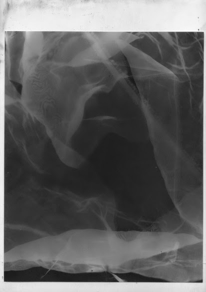
When using photoshop or other digital means to create images its hard to create textures that look authentic. We stumbled across a project the photography students had done where they had been using random objects to make interesting collages with photograms. 
So by raiding the print room for scrap materials we set about creating ice like textures and also textures that looked aged. This way we could add them to our images to give them a rustic and aged affect with authentic appearance. After this we set about creating these textures with simpler means as well.This in my opinion created some interesting and surreal outcomes that look great. 

1 Oct 2014

Clashes of style


I experimented with photoshop and created these. I was happy with the outcomes. 


Gradient Tool


One aspect of the posters we were thinking of using was gradients and shapes. We all found the use of them very interesting in appearance and effect, especially the dark and light contrast that added to the image and also the interesting way of putting images into shapes.
This was through research where we looked at certain graphic designers. It was a more of a simplified, but effective way of producing work that we felt looked refined and clean. However we didn’t know to use the gradient tool, so using our initiative we researched on how to use it, by looking at youtube tutorials. Using a step by step guide we were able to come up with the images above where we have produced some interesting colours and unique ways of putting images into shapes. This was one possible avenue of producing our final piece. I was really pleased with this as it was something new I could add to my own skill set and that I could use in the future. 

Gallery/Museum Visits


We visited galleries and museums to help in terms of research and final images. We visited the imperial war museum. This was because  of the time period Ernest’s adventure was based around (1914-1918), we wanted to understand more about that period in time and how it linked in with him, which we could then use to influence our artwork. We also looked at how pieces and items were displayed, and discovered some useful references in regards to typography and display. We could then use these references in our own displays and produce professional looking work. 

This was an incredibly moving experience for me as I got to see all different stories from soldiers and the struggles they went through. It helped in terms of linking Shackelton to be being a failed hero and a symbol of people who weren't admired as the world war one heroes.