10 Aug 2015

Amsterdam !!!


I haven't posted in a while because I've been enjoying my summer break. Luckily I went to the beautiful city of Amsterdam with all of its culture, amazing architecture and history. Id definitely recommend visiting.

It was such a pretty city and its given me a lot of inspiration and ideas. Its made me think about artists of the past and I can clearly see why Holland as a place can create so many great artists- Van Gogh, Rembrandt ........
The Stedelijk museum is a modern and contemporary museum I visited and it had so many different varieties of artwork from paintings by Matisse, Picasso to more modern ideas like Anish Kapoors. Even the building itself is beautiful, a mix of modern architecture and brilliant design. http://www.stedelijk.nl/en

Rembrandt 


Saint - Etching 

I didn't really know a lot about rembrandt before I visited his house or saw his work. His house was situated along side the canal's and you can see where he got inspiration from. I managed to see the way he worked, usually in etchings and quick sketches and I absolutely love his style. Its looks very modern in my opinion, but so relaxed and neat. I saw his studio space and the powdered oil paints he kept as well. His study smelt like turps and brush cleaner just like my room did for my Ernest Shackleton painting i did.  I was fascinated in the way he used other artists work as reference and tried to copy the style and way they worked to influence his own work. I want to work in the same style and method in future work as I see similarities with my own style and line mark. A true art legend and inspiration to me and I feel very lucky and privileged to see his work. 


Vincent Van Gogh 

This was an interesting one for me because Ive only ever really seen his most famous work like the flowers he painted and I've always had a perception of what his work looked like. I couldn't have been more wrong. When you get to see his work up close I can clearly see the mark making and expressive nature of his work. He was trying to capture a suggestion and mood. For example in his self portrait's, it wasn't about self obsession, but about capturing a facial expression. I learnt a lot about colour and the importance of getting the right colour balance. He spent years trying to perfect his skills and did drawings daily to improve. You can really see the difference in his earlier work to his older and more matured work.


Again he used other artists as a reference point to try and lean new skills on composition and ways of working, exactly what I have been doing.


Wheat field with crows (1890)


Matisse ( View of Notre Dam 1914 ) 

Matisse's work was very different and a lot more modern thinking in my opinion. It was more about composition and material used than anything else. It was good to see thought put into where something was placed and simplicity in the way he work. 


 Picasso

Ive done a lot of essays over the years on Pablo Picasso, seeing his work up close you can see the bizarre reality of his paintings and the thought process again. It might not be clear at first, but it comes together when you look properly and understand his concepts. This was a painting of a nude model he did, very divided but influenced by his links with cubism and shapes.




6 May 2015

Q & A with Rohan Daniel Eason


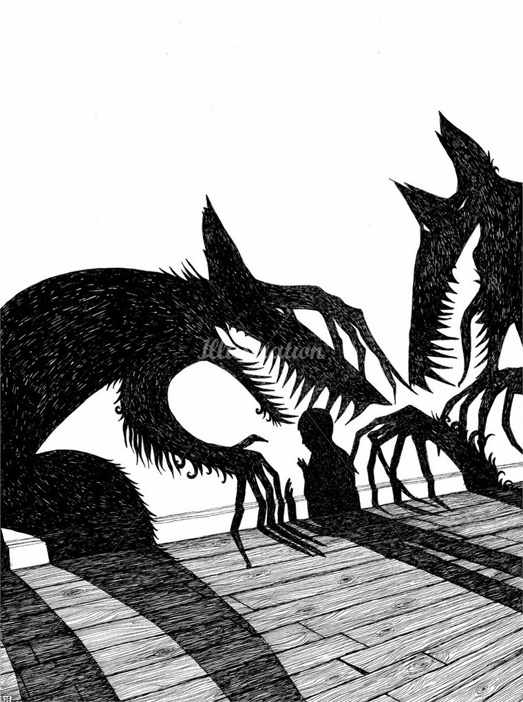
Contacting professional illustrators has been so hard to do, as many of them dont reply and already have Q & A sections on their own websites, so I was delighted when one of my favorite artists, Rohan Eason replied to my questions. 

He is a pen and ink illustrator, who creates black and white imagery. His work has been widely used in children's and adults book illustration. I absolutely love his style and it was a pleasure talking to him. 

You can check out his work here at http://www.rohaneason.com

1) what inspired you to first start drawing ?

I drew from a very early age, I always loved too, my mums an artist, my uncle was an artist, and it felt like something I didn't have to try to do. 

2) Do you think it is important for your drawings to have a connection to the subject your working with ? 

As a professional illustrator you don't have the luxury of a connection with the subject matter or project ethos. Sometimes you win, sometimes you face tedium and banality head on, and it's your job to squeeze some life and character into it. 

3) What are the inspirations behind your work and working methods?

I was first inspired by Aubrey Beardsley, in my teens, I was struck by the stark black and white line, and the beautifully balanced compositions. I decided that I would aim to have the same quality of line that he created, and really study the craft of drawing with ink. 

4) Following on from the last question, is research an integral part of your working process?

Research is always the no1, process. Nothing really begins without reading the book, or gaining a back-story, visiting a location, or speaking to the writer. I have a huge collection of books to trawl through and then of course the Internet now offers a huge research library. I may sketch immediately ideas of composition, but it's like putting a jigsaw together, and each element must by researched and chosen. 

5) From looking through your work, you use pen and ink in quite a few pieces. What is it about that medium that you like ? 

It's immediate and allows for no mistakes. It's a skill that I can improve over my life time, it's important to me to create artworks, and not just illustrations.  I want the work to be a direct reflection of the skills of my hand, there is something human in that, a connection which you don't get with digital arts. Which is why I keep computer work to an absolute minimum, only using for scanning and simple retouch. 

6) How important do you feel composition is to your work ? 

Very important. I will try many compositions before settling down on one. Sometime I will sketch a piece and then simply turn it , and re sketch, changing the angle for the viewer and creating a more interesting perspective. Composition is paramount. 


7) How much freedom do you have when creating your work ? 

An illustrator is always restricted by the brief, and it is the skill of the illustrator to find freedoms in that. You must present everything required, plus the special parts not thought of, or represented in the brief. It's not your job to change the brief but reimagine it.

8) Throughout your career what would you say is your biggest achievement?

Every book or project I complete is my best work to date, I'm always striving to be better so self congratulation is fleeting. I always look back and see the mistakes rather than the achievements, in that it's a journey that I focus on. Rather than the goals of completion. 

Relational aesthetics


This is a valuable lesson I have learned from my context lessons. Relational aesthetics is where a piece is created with the audience or onlooker in mind. So for example creating my parkinson's images, I had to think about how people with parkinson's would think and feel about the images. It really makes you consider and think about your drawing and consider the relationship the drawings must have with the onlooker.

Children's Books Conclusion

I am very pleased with how my book and the pages I have created have turned out. I think I have kept true to a consistent style of work and kept the style of drawing the same. I have stuck to my core pricniples of line, texture and shape throughout each page. I think a good point is that I haven't just stuck to what I know, I have tried to adapt my style and try and whole range of new processes such as experimental forms of mark making.

I think a weakness of my book could be that as I haven't finished every single one of my images it becomes quite hard to understand and read the storyline, affecting what the reader will understand about the story. I think next time I create a book I will stick to my mark making style as i like the unpredictable nature of the marks and that way of working really fits in well with a children's book style.

After having many weeks or trying and many weeks of hard work, I have a new found respect for children's book illustrators. the amount of effort and time spent to make a book look professional, consistent and good is staggering. Ive learnt so many new things from this unit.


  • To try and keep a consistent style 
  • Keep up to date with work 
  • Find the right feel and look to suit the audience 

Tales of the City


This was my image for the brief ' tales of the city' it was a very open brief basically open to your interpretation. This might seem strange but I got the idea for my image from a dream I had. I was in a park with a man feeding ducks, however the man had a ducks head instead. I just think it was quite a surreal image and I think it really suited a  scene that I could see in somewhere like Manchester.

Ive tried to use collage and be really experimental with how I have created it. Thinking about composition, mark making and use of colour. My influence for this come from things like dada who use used very abstract imagery swell as surrealism, with their dream like imagery.


I also took a lot of photo's of Manchester as this is the place that inspired me with this idea. I wanted to capture the mood of the city and try and reflect what I saw in my dreams. I tried to capture different perspectives and views. 


Multiple Images


This was my most challenging page as I and to consider not only how Sultan looked, but also his posture and trying to create a human. I had no idea what I wanted my human to look like at first. I decided to go with a simple line drawing that represented a feeling or emotion in this case being scared. I think it goes well with the animal characters. I wanted to keep the consistent white spaces throughout  my pages and had to consider composition with this piece a lot. I did this so the page didn't become to crowded.

A weakness of the page is sultans drawing. I struggled to imagine what the dog looked like side on, so had a trial and error kind of moment with him.

Raven


 For this page I wanted to create a raven. I wanted the marks to mimic the texture and feel of a birds feathers. So I used darker and lighter shades of black ink and I was quite free flowing with how I applied the marks. the image originally was just the bird on its own, but again like other images it looked to flat, so I decided to add a butterfly and make it very vibrant so it came to the forefront. I enjoyed making this page. The weakness of it is that perhaps the butterfly detracts from the main raven image.