Showing posts with label Children's Books. Show all posts

6 May 2015

Q & A with Rohan Daniel Eason


Contacting professional illustrators has been so hard to do, as many of them dont reply and already have Q & A sections on their own websites, so I was delighted when one of my favorite artists, Rohan Eason replied to my questions. 

He is a pen and ink illustrator, who creates black and white imagery. His work has been widely used in children's and adults book illustration. I absolutely love his style and it was a pleasure talking to him. 

You can check out his work here at http://www.rohaneason.com

1) what inspired you to first start drawing ?

I drew from a very early age, I always loved too, my mums an artist, my uncle was an artist, and it felt like something I didn't have to try to do. 

2) Do you think it is important for your drawings to have a connection to the subject your working with ? 

As a professional illustrator you don't have the luxury of a connection with the subject matter or project ethos. Sometimes you win, sometimes you face tedium and banality head on, and it's your job to squeeze some life and character into it. 

3) What are the inspirations behind your work and working methods?

I was first inspired by Aubrey Beardsley, in my teens, I was struck by the stark black and white line, and the beautifully balanced compositions. I decided that I would aim to have the same quality of line that he created, and really study the craft of drawing with ink. 

4) Following on from the last question, is research an integral part of your working process?

Research is always the no1, process. Nothing really begins without reading the book, or gaining a back-story, visiting a location, or speaking to the writer. I have a huge collection of books to trawl through and then of course the Internet now offers a huge research library. I may sketch immediately ideas of composition, but it's like putting a jigsaw together, and each element must by researched and chosen. 
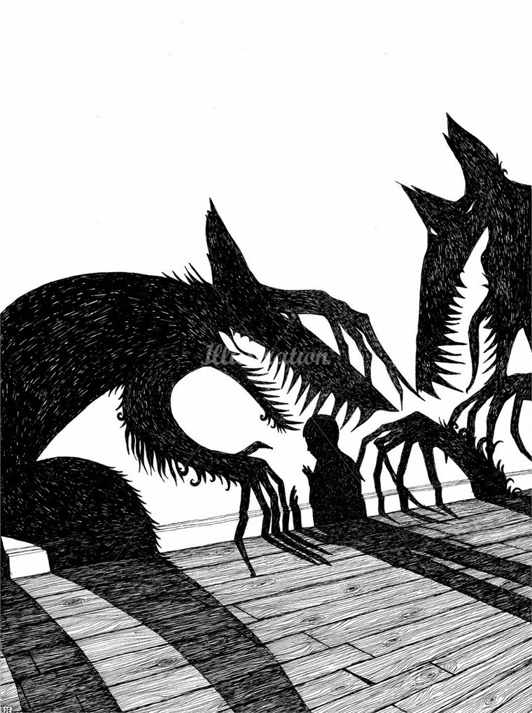
5) From looking through your work, you use pen and ink in quite a few pieces. What is it about that medium that you like ? 

It's immediate and allows for no mistakes. It's a skill that I can improve over my life time, it's important to me to create artworks, and not just illustrations.  I want the work to be a direct reflection of the skills of my hand, there is something human in that, a connection which you don't get with digital arts. Which is why I keep computer work to an absolute minimum, only using for scanning and simple retouch. 

6) How important do you feel composition is to your work ? 

Very important. I will try many compositions before settling down on one. Sometime I will sketch a piece and then simply turn it , and re sketch, changing the angle for the viewer and creating a more interesting perspective. Composition is paramount. 


7) How much freedom do you have when creating your work ? 

An illustrator is always restricted by the brief, and it is the skill of the illustrator to find freedoms in that. You must present everything required, plus the special parts not thought of, or represented in the brief. It's not your job to change the brief but reimagine it.

8) Throughout your career what would you say is your biggest achievement?

Every book or project I complete is my best work to date, I'm always striving to be better so self congratulation is fleeting. I always look back and see the mistakes rather than the achievements, in that it's a journey that I focus on. Rather than the goals of completion. 

Children's Books Conclusion

I am very pleased with how my book and the pages I have created have turned out. I think I have kept true to a consistent style of work and kept the style of drawing the same. I have stuck to my core pricniples of line, texture and shape throughout each page. I think a good point is that I haven't just stuck to what I know, I have tried to adapt my style and try and whole range of new processes such as experimental forms of mark making.

I think a weakness of my book could be that as I haven't finished every single one of my images it becomes quite hard to understand and read the storyline, affecting what the reader will understand about the story. I think next time I create a book I will stick to my mark making style as i like the unpredictable nature of the marks and that way of working really fits in well with a children's book style.

After having many weeks or trying and many weeks of hard work, I have a new found respect for children's book illustrators. the amount of effort and time spent to make a book look professional, consistent and good is staggering. Ive learnt so many new things from this unit.


  • To try and keep a consistent style 
  • Keep up to date with work 
  • Find the right feel and look to suit the audience 

Multiple Images


This was my most challenging page as I and to consider not only how Sultan looked, but also his posture and trying to create a human. I had no idea what I wanted my human to look like at first. I decided to go with a simple line drawing that represented a feeling or emotion in this case being scared. I think it goes well with the animal characters. I wanted to keep the consistent white spaces throughout  my pages and had to consider composition with this piece a lot. I did this so the page didn't become to crowded.

A weakness of the page is sultans drawing. I struggled to imagine what the dog looked like side on, so had a trial and error kind of moment with him.

Raven


 For this page I wanted to create a raven. I wanted the marks to mimic the texture and feel of a birds feathers. So I used darker and lighter shades of black ink and I was quite free flowing with how I applied the marks. the image originally was just the bird on its own, but again like other images it looked to flat, so I decided to add a butterfly and make it very vibrant so it came to the forefront. I enjoyed making this page. The weakness of it is that perhaps the butterfly detracts from the main raven image.

5 May 2015

Cats !!!!


Ive really like drawing cats in this project, I just think they are easier to draw then dogs especially as they have definite line and body structures. Whereas with a dog its fur covers most its body so its harder to define parts of it.

I think in all these images here you can see the different compositions. I have tried to experiment with it and different layouts for each image. From just sections of the animals to the way it moves. Ive tried to keep the wool line from an earlier page going throughout every page to try and keep it consistent.

I think a weakness is potentially in the last images, as I really struggled to draw shadows and which way they are meant to fall in the background. The unpredictable nature of the black marks of the cat really help to make him stand out.

Wolf in woods

These were two pages I worked on at the same time as I felt they were most in common with each other, with lots of overlapping features in both. I think the The bottom image works the best with the contrast between light and dark and the textures of the bushes especially working in my opinion. The only problem being the colour scheme and its not consistent, but I just felt that the black and white suited Sultans situation being in a dark a scary wood.

Both of these pages took a  lot of different scanned in images to compose and put together.

Wolf up a tree !!


This was the page where the wolf had just been scared up a tree by the cats shadow. I think I have really captured the colour and look of a tree. Using the a3 scanners I managed to put together the leaf marks I had made for my tree. I found it really hard to do at  first because leaves are very hard to draw and I was thinking to literally so I changed my approach to changing back to mark making and focusing on the shape of the leaves instead.

I used pastel rubbings from trees to recreate the texture of wood and I think it works here as I can see the jagged edges and rough surface of the tree. This page was a challenge.


1 May 2015

Poppy field


  This was one of the last pages of the  book and I really wanted to illustrate the bright mood and upturn in fortunes for Sultan and the story. So I wanted to draw a poppy field. I thought it worked well with the image I was trying to create,which was one of vibrancy and positivity. I placed the wolf in the background as I wanted him to be ever-present and alway around, but almost hidden. The obvious weakness for this page was my time keeping as I didn't have enough time to draw sultan into it. He was meant  to be running throughout the fields happy. I think a strength of this piece is sense of perspective and distance with the wolf further away.                                  

27 Apr 2015

Hill's


I found this page in particular so difficult to do. Hills and landscapes are very hard to try and recreate. I just couldn't decided on what medium to use and was trying everything from paint, ink and water colour. I discovered from using water colour that if I toned down the colours I really matched the effect I was trying to create, sort of old muddy hills. 

The texture it create work nicely. I want to make the image not flat though so I added little detailed drawings of ladybugs and plant to try and make the image look different. 


23 Apr 2015

Wolf


Fox


This was my final design for my fox page. I was really happy with how this turned out. Ive tried to use the brightness of orange ink to really capture the colour of the fox. I think it works well especially for a children's book. Ive also tried to think about composition with how the tail stretches across two pages.

Ive tried to think about line, texture and shape here.


22 Apr 2015

Sheep and the Wolf


A lot of different marks went into this page. First of all it is so hard to draw grass and try and get it to look similar. I had to think outside the box and do pastel markings of actual grass in my garden. It was different, but also I think the texture of the grass looks good.


These were my original efforts for my wolf dreaming about sheep double page. I wasn't happy with them as the images were to flat and the colour scheme didn't match with the simplistic colour scheme of other pages. My experimentation with typography didn't come to much either as the type was didn't fit in with the page. ( Something I need to improve on).

I went back to the drawing board and thought about how I could make the image stand out more and have perspective. So I decided to add lines to the sheep again and introduce flowers into the forefront to create different levels of perspective. I think its looks more professional now and has improved the feel of the page.


21 Apr 2015

Cat


This was my favorite I created for this unit as I think I really got the balance between line and shape here with the line ball. I knew instantly I wanted to do something along these lines. I have used dark ink marks to try and recreate the fuzzy nature of the cat and using influences like catherine Rayner I believe i have achieved  that. I think a downside could possibly be the expression on the face of that cat is a bit sterile and non existent though.

Below are the different components of the piece to try and show you what process i am trying to achieve for this unit.


20 Apr 2015

Story Board's


One aspect of illustration that I tended to forget about was planning out drawings and creating storyboards. I carefully though about each page and using parts of my research, set out how I wanted my illustrations to look on each page. I had to consider placement and positioning and think about whether I wanted my images to be close ups, far away at an angle.... all different perspectives.

Its really helped me to think more clearly about final outcomes and how I want it to look finished. Some of my designs are clever in my opinion as I used the animals features to fit the page, for example the foxes long tail. I thought it would look good across

15 Apr 2015

Character's Old Sultan


 These were the final designs for my two main characters the wolf and Old Sultan. I was really happy with how they turned out and the look and feel of them really suit the type of illustrations I am trying to produce. I think the shape and dark texture of the wolfs fur really make hime look menacing. The dog looks good as I think i have captured his innocence, but I have given him an almost dirty look - his fur looks tired and old and with no outline he's almost fading away. I purposely didn't give him an outline as it is meant to represent his ignored character within the story.

In terms of weaknesses I think that the wolf could look at bit more dangerous and the sharp white teeth could improve that image. I think in terms of the dog the colour might be an issue as its very hard to replicate the same effect and what is it going to look like when he's say side on or in a different position.

I face a huge problem with trying to replicate the quality of these as the marks and way I produced them were experimental, so whether I can replicate that same feel and look will be a challenge. Overall though I am satisfied with my attempt.

  Process 

I started out with mark making and set out to mimic the texture and feel of the wolfs fur. I used charcoal and pastel and tried to softly rub them on rough paper. I then drew an outline of a wolf and used photoshop to change the colour and darkness to make the wolf darker more menacing. 


I made sure I tried a few different backgrounds and textures in the wolf shape to see other alternatives and different sides. 


Here Ive tried to create a number of different marks to try and recreate different fur marks that i could then put over Sultan. I used a brown water colour for his colour, which I think works well as it looks tired and almost muddy which works well. I then changed the vibrance of his fur colour and overlaid the colour. 


10 Apr 2015

Character Development


Reading the story numerous times I had to understand who the characters are and what characteristics they have. I discovered that the main character Sultan is and old dog, so I wanted to find a dog that looked old and warn out and thought the Italian Spinone dog was the best match. Everything about it from the fur to the way the ears drop down made me think this was ' Old Sultan'. I could just imagine this dog running around on a farm. I think this dog is exactly how I want my main character to look.

I thought the best way to go about creating the character drawing wise was to do a load of studies similar to life drawing, so I could get the shape, size and face structure right. I think they look really good and having to look very closely at all the different parts of the dog helped me to draw it. The one aspect I am worried about is the  fact that this dogs face is very hard to draw because its fur covers its facial structure- i.e. no jaw bone and no straight lines.


I repeated the same process with the Wolf character. I want him to look very dark and mysterious, basically make him look like a bad guy. Wolves are a lot easier to draw personally for me as they have lots of  straight lines to them and are easily defined.

8 Apr 2015

Old Sultan

Old Sultan

Jacob and Wilhelm Grimm

A farmer had a faithful dog named Sultan, who had grown old and lost all his teeth, and could no longer hold onto anything. One day the farmer was standing with his wife before the house door, and said, "Tomorrow I intend to shoot Old Sultan. He is no longer of any use."
His wife, who felt pity for the faithful animal, answered, "He has served us so long, and been so faithful, that we might well give him his keep."
"What?" said the man. "You are not very bright. He doesn't have a tooth left in his mouth, and no thief is afraid of him. He can go now. If he has served us, he has eaten well for it."
The poor dog, who was lying stretched out in the sun not far off, heard everything, and was sorry that tomorrow was to be his last day. He had a good friend, the wolf, and he crept out in the evening into the forest to him, and complained of the fate that awaited him. ....

Read the whole story here:http://www.pitt.edu/~dash/grimm048.html

I decided to go with the out of copyright Grimm's fairy tale story Old Sultan. I didn't feel confident in my ability to write my own short story, which is a weakness that I need to improve on. I was looking for a long time though and researching lots of different stories until I found this one. I felt and instant connection with the story and knew I could create illustrations for it.

The story is about an old dog. A farmers dog that us unwanted and unloved by his owner. A story of betrayal and loyalty with these themes running throughout. I love all the different characters from the wolf, to the farmer. i think I could really create something brilliant here and connect with the story. the hard part now is finding the style I want to create the book in.

5 Apr 2015

Pecha Kucha

Interesting website all about it http://www.pechakucha.org

Pechu Kucha is a presentation where you have to talk about 20 images and you only nave 20 seconds to talk about each image. It has to naturally flow and each image should lead on to another one. Im not the best at speaking, but I gave this my best shot and talked about my Macmillan project.

It went really well I thought  as I had a clear plan and order. I talked about my strengths and weaknesses and what inspired me. It was another confidence booster for me and people genuinely seemed interested to see my work and the way I worked.

Heres a great with some tips on how and what to do for a Pecha Kucha Presentation


4 Apr 2015

Kaatje Vemiere - artist research


http://www.kaatjevermeire.be

I have no idea why, but I think this piece really looks and has the same feel to some of my previous work. I really admire the use of mark making for this like the grass and the trees and I think the composition works really well with aspects further back than other. I want to use this method.

1950s Polish Illustrations


I was looking at past illustration for fairy tale books and came across these Polish drawings from the 1950's. Both of them are gorgeous pieces and really like the drawing style especially the use ink to create really simple shapes like the dog or the fisherman. I like the colour shames as well with inly a few colors used effectively. Maybe a limited colour palette is something I will have to consider.

I also like the positioning of the images with thought given to space how the images looks when actually on the page. I definitely want to do my own in this style that has influenced me a lot. Even though its old it has more in common with the way I work than most modern pieces I have seen.